
Mobile-Friendly Websites: Why Most of Your Customers Browse on a Phone

- Most customers in Vietnam browse on a phone, so that's the screen to get right first — not the desktop.
- A mobile-friendly (responsive) website is a single version that adjusts to any screen size, with text large enough to read and buttons large enough to tap.
- Warning signs of a broken mobile site: needing to zoom to read, sideways scrolling, missed taps, overflowing images, and a phone number you can't tap to call.
- Speed on a mobile connection matters as much as layout — compressing images alone can make a clear difference to how fast the site opens.
- You can check your own site in a few minutes by going through it on your phone as if you were a first-time customer.
A mobile-friendly website is no longer a nice-to-have — it's how you keep customers from walking out the door. Open your site analytics right now: most visitors come from a phone, not a desktop. Customers tap your Facebook ad on their phone, read your page on their phone, and call to order from their phone.
The trouble is that many sites are designed for a desktop screen first, then squeezed onto a phone as an afterthought. Visitors open the page and see tiny text that needs pinching to read, buttons jammed together, and images spilling off the edge. Patience runs thin fast — three seconds of friction and they're gone.
Here's what mobile-friendly actually means, how to spot a broken mobile experience, and how to check your own site in a few minutes without any technical knowledge.
Most customers in Vietnam browse on a phone
Think about your own habits. Your phone is in your hand all day — scrolling Facebook, chatting on Zalo, finding a restaurant on Google Maps. The laptop only opens when you sit down to work. Your customers are the same. A clothing shop owner running Facebook ads will find that almost everyone who taps through is on a phone, because people are lying on the couch scrolling, not sitting at a desk with a laptop open.
This changes how you need to build your website. A homepage that looks neat on a 24-inch desktop monitor is not the same as one that works on a screen the width of a hand. If customers have to scroll sideways, zoom in to read the price, or hunt around to find the call button, they leave — and you lose the order without ever knowing it. It's part of why many small business owners think a Facebook page is enough, but if you're still weighing that up, is selling on Facebook enough goes through it in detail.
What does a mobile-friendly (responsive) website actually mean?
A mobile-friendly website is one that automatically adjusts to fit whatever screen the visitor is using. On a desktop it spreads wide; on a phone it stacks vertically, with text large enough to read and buttons large enough to tap with a thumb. The technical term for this approach is responsive — the page responds to the screen size.
The wrong approach, still used by many builders, is to create two separate versions: one for desktop and one for mobile. The mobile version often has features cut out, updates made in one place get missed in the other, and over time the two drift apart. A proper mobile-friendly site has one single version; the content is the same, only the layout shifts to suit the screen.
What does a good mobile site look like?
- Text you can read straight away without zooming — no squinting at the price or phone number.
- A single column of content running top to bottom, smooth to scroll, no sideways swiping.
- Call and Zalo buttons within easy thumb reach — one tap and it works.
- Product photos that fit the frame cleanly, not overflowing or distorted.
- A menu that collapses to a three-line icon; tap it to expand, so it doesn't eat the whole screen.
Signs your website isn't mobile-friendly
You don't need to write code to spot these. Pick up your own phone, open your website, and watch for any of these situations:
- You have to zoom to read. The text comes up tiny — you have to pinch and expand. This is the clearest sign of a site built for desktop and crammed onto a phone.
- You have to scroll sideways. The page is wider than the screen; you swipe right to see the rest. Customers hate this.
- You keep tapping the wrong thing. Buttons and links are bunched too close together; a thumb hits the wrong one.
- Images don't load or overflow the screen. Product shots taken on a high-end phone come in at several megabytes each, uploaded without compression. On a 4G connection they creep in slowly.
- Tapping the phone number doesn't dial. Customers have to memorize the number and dial it manually, instead of tapping once and having the phone call.
Three seconds of friction and customers leave. Every exit is an order you paid to bring in with ads — then dropped.
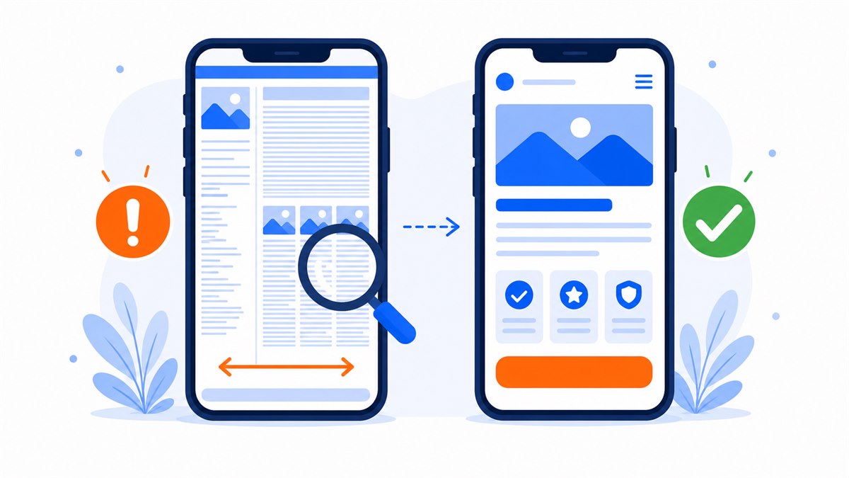
Buttons, text size, and forms on a small screen
These three things decide whether a customer stays or goes. On a small phone screen, every detail carries weight.
Buttons need to be thumb-sized
People tap a phone website with their thumb, and a thumb is far wider than a mouse cursor. A button that's too small, or placed too close to another button, leads to missed taps, frustration, and exits. Your most important buttons — Call now, Order, Message on Zalo — need to be large, clear, a standout color, and well-spaced from everything else. A cafe that wants customers to book a table should have the call button right at the top of the page, one tap and it's done. For a deeper look at writing and placing buttons customers actually press, see effective calls to action.
Text needs to be large enough to read comfortably
Phone text needs to be bigger than you'd think. Older customers, people reading in bright sunlight, people holding the phone at arm's length — they all need to read without zooming. Prices, product names, and phone numbers are the last things that should ever be small.
Shorter forms close more deals
Typing on a phone is much harder than typing on a keyboard. A form that asks for ten fields is the fastest way to lose a customer. A spa only needs a name, phone number, and the service they want to book — enough to call back and close. Fewer fields, higher completion. If you want to go deeper on reducing friction so customers finish their order, conversion rate optimization for landing pages covers it thoroughly.
Speed on a mobile connection
A mobile-friendly website isn't just about how it looks — it also needs to be light and fast. Phone users are often outside, in a cafe, somewhere with a weak signal, or on a patchy 4G connection. A site that loads in a flash on office Wi-Fi can crawl when a customer opens it at a street market.
The most common culprit is heavy images. A shop owner shoots products on a decent phone — each image a few megabytes — then uploads them straight to the website without compressing. On Wi-Fi this is fine, but a customer on 4G waiting ten seconds for images to appear will leave. Customers typically abandon a page if they're waiting more than about three seconds.
Speed and mobile-friendliness go hand in hand, because phone visitors need both a clean layout and fast loading. For a full breakdown of how to compress images and slim down your site, read page load speed and how to improve it.
How to check your own website for mobile-friendliness in a few minutes
No need to hire anyone or buy software. Pick up your own phone and go through these steps as if you were a first-time visitor:
- Open the site on mobile data, Wi-Fi off. Count how long it takes for the page to fully load. More than three seconds means the site needs to be lighter.
- Read the homepage without zooming. Can you read the price, product names, and phone number? If you have to pinch-zoom, the text is too small.
- Tap the buttons with your thumb. Are they easy to hit, or do you keep missing? Are the call and Zalo buttons within easy reach?
- Tap the phone number. Does the phone open a call screen automatically, or do you have to dial manually?
- Fill out the order form. Is typing easy? Too many fields? Does it confirm success after you submit?
- Scroll from top to bottom. Any horizontal scrolling needed? Images overflowing? Text overlapping?
Ask a few people at home to open the site on their own phones too, since different phones have different screen sizes. Write down anything that feels awkward and fix them one by one.
If you run through this and find a long list of issues that keep resisting fixes, the original platform the site was built on probably wasn't mobile-friendly from the start. At that point, rebuilding a clean, fast page — with a prominent call button, Zalo, Messenger, and a contact form — is usually more effective than patching individual problems.
Frequently asked questions
Is a mobile-friendly website the same as a responsive website?
Essentially yes. Responsive is the technical approach — building a site that adjusts to any screen size. Mobile-friendly is the result: a site that displays well and is easy to use on a phone. A properly responsive site is automatically mobile-friendly.
My old site was built for desktop. Can it be made mobile-friendly?
It depends on the original platform. If it was built properly, adjusting the mobile layout may be straightforward. But many older sites need so much patching that rebuilding from scratch with mobile-first in mind is faster and cheaper.
How do I find out whether my customers use phones or desktops more?
Install Google Analytics and check the device breakdown in your reports. You'll see the split between phone and desktop traffic. For most Vietnamese sales pages, especially those running Facebook ads, phones dominate.
Does a mobile-friendly design automatically make the site fast?
Not on its own. A responsive layout handles the visual arrangement; load speed depends separately on whether images are compressed and whether the hosting is solid. You need both for a good phone experience.
Need a professional website or landing page?
Web Trong Ngày delivers in 24 hours, all-in for $40 — preview the demo first, pay only when you are happy, own it for life.