Call-to-Action Buttons: What to Write and Where to Put Them So People Click
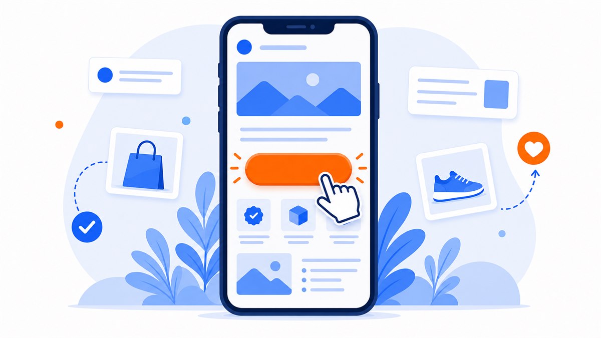
- A call-to-action button is the bridge between interest and contact; a page without a clear button will lose orders no matter how good the content above it is.
- Write button text with a concrete verb and a stated benefit — avoid vague words like Submit or Contact.
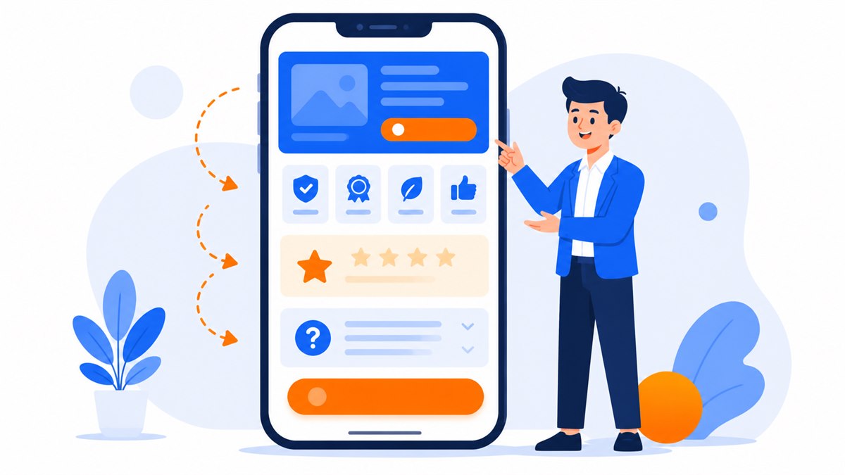
- Place buttons at the top of the page, after each persuasion block, at the bottom, and as a sticky floating button for phone screens.
- Each page should have one primary action so visitors are not paralyzed by too many choices.
- Add a short reassurance line right next to the button — such as free consultation or see the demo first, pay only when happy — to remove the hesitation that stops people from tapping.
A visitor reads your page, nods along, and then — closes the tab. The most common reason is the call-to-action button: the thing you want people to tap. Wrong wording, wrong placement, or text that creates doubt is all it takes to lose an order, no matter how well-written the rest of the page is.
Many shops, restaurants, and spas have seen more inquiries simply by rewriting their button text and moving it to the right spot on the screen. Here is how to write the text, position the button, and address the hesitation that stops people from tapping.
What is a call-to-action and why does it determine whether you get orders?
A call-to-action is the copy and the button that asks a visitor to do one specific thing right now: call, message, book an appointment, or leave a phone number. The concept is simple — it is where you spell out the next step instead of leaving people to guess.
Many pages are beautifully written about their products but then leave visitors to figure out what to do next. No clear button to tap, no number to call, so they leave. A restaurant with a gorgeous menu but no obvious "book a table" button gets visitors who browse and forget. The button is the bridge between interest and action.
A page without a clear call-to-action is like a shop that opens its doors but forgets to set up a checkout counter.
Writing button text: use a specific, concrete verb
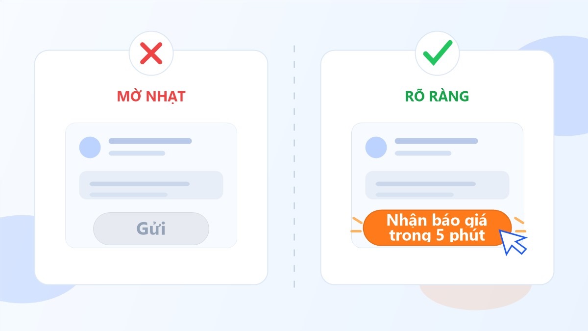
The most common mistake is vague text like Submit, Continue, See more, or Click here. None of those tell visitors what they get when they tap. Start with a verb and state the outcome the visitor receives.
Comparing weak text with clear text
- Replace Submit with Get a quote in 5 minutes
- Replace Sign up with Book a free first haircut
- Replace Contact with Message us for advice
- Replace Learn more with See the all-in pricing
A spa with a Sign up button makes visitors nervous — it sounds like paperwork. Switching to Book your first skin treatment drives far more taps, because people can picture what they are getting. Button text should be short enough to read easily on a phone, and written in the customer's voice, not internal company speak.
Where should you place call-to-action buttons on the page?
Placement matters as much as wording. Most visitors in Vietnam browse on a phone with a small screen and scroll quickly, so the button needs to appear exactly when someone is ready to act — they should not have to hunt for it.
- At the very top: one button in the first section visitors see, for people who are already ready.
- After each persuasion block: right after a benefit paragraph or a real photo, put a button so visitors can tap while the enthusiasm is fresh.
- At the bottom of the page: after the reviews and FAQ section, a large button to close the deal.
- A sticky floating button: a tap-to-call or chat button pinned to a corner of the phone screen, always within reach no matter how far down someone scrolls.
This layout approach is tied directly to the structure of a high-converting sales landing page — every content block should end with an invitation to act. When the content and the button align, visitors always have a clear path to get in touch.
How many call-to-action buttons should one page have?
The answer is a little counterintuitive: a page should repeat the same call-to-action several times, but there should be only one primary action. Repeating the button is fine — visitors seeing a way to contact you at every scroll point is good. What you want to avoid is presenting too many different options that leave people unsure.
A page that shows Buy now, Download the guide, Subscribe for updates, and Follow on Facebook all at once will confuse visitors. The more choices, the easier it is to choose nothing. Settle on the one thing you most want visitors to do — usually leave a number or send a message — and point every main button toward that goal.
Once you narrow to a single clear goal, measuring and improving becomes straightforward. This is the foundation for conversion rate optimization for landing pages later on, because you know exactly which number to track.
Easing the doubt that makes visitors hesitate before tapping
Just before tapping, a visitor's mind runs through a few quick questions: Will I get spammed? Do I have to pay right now? What if I don't like it? If you don't answer those questions, people take the safe route and leave. A few small lines placed right next to the button can clear all that doubt.
Short lines worth placing directly below the button
- Free consultation — no obligation to buy — removes the fear of being pressured.
- See the demo first, pay only when you're happy — removes the fear of wasting money.
- We reply within 15 minutes during business hours — tells people when to expect a response.
- Your information is kept private — reassures people about sharing their phone number.
At Web Trong Ngay, right next to the contact button there is a line that reads: see the demo first, pay only when you're happy — plus the domain and first-year hosting are included in the all-in $40 price. That reduces hesitation and makes it easier to tap. Clearing this kind of doubt is part of the bigger picture covered in the 8 trust signals that make customers comfortable buying online — a button only earns clicks once visitors trust you enough.
One technical detail that often gets overlooked: the button itself must be easy to tap on a phone. A button that is too small, too close to the screen edge, or sitting on a page that takes more than three seconds to load will lose visitors before they ever get the chance to tap.
Good buttons vs. bad buttons — real examples to compare
Examples are easier than theory, so here are a few side-by-side pairs drawn from real pages I have worked on.
A clothing shop
- Weak button: Submit sitting alone, with no indication of what happens next.
- Strong button: Message us to check stock with a line that says we reply quickly during business hours.
A pho restaurant adding takeout orders
- Weak button: Contact buried at the bottom of the page in small text, with no phone number visible.
- Strong button: Call to order takeout as a floating button always showing in the corner of the screen.
A skincare spa
- Weak button: Sign up now sounds like a big commitment, which makes people hesitate.
- Strong button: Book your first skin treatment paired with a line that says free consultation, no obligation to buy.
What all the strong buttons have in common: a clear verb, a specific benefit, plain everyday language, and a position that is always within reach. How you write button text is also closely tied to the overall tone of your page — see how to write persuasive landing page copy so your button wording fits the rest of the content.
Frequently asked questions
How many words should a call-to-action button have?
Short and direct — usually two to five words is enough. Start with a verb and state what the visitor receives, for example Get a quote in 5 minutes. Avoid vague words like Submit or Continue because visitors have no idea what happens when they tap.
How many call-to-action buttons should a landing page have?
Repeat the same call-to-action several times as visitors scroll, but stick to one primary action such as send a message or leave a number. Too many different options leave visitors confused and more likely to do nothing.
What color should a call-to-action button be?
The most important thing is that the button stands out clearly against the background and surrounding content — use a contrasting color reserved for the primary button only. The specific color matters less than whether the text is clear and whether the button is at eye level on a phone screen.
How do I know if my call-to-action button is working?
Track the ratio of people who actually tap and get in touch versus total visitors to the page. Try changing the text, the position, or the reassurance line below the button, then compare results. Change one thing at a time so you know which variable made the difference.
Need a professional website or landing page?
Web Trong Ngày delivers in 24 hours, all-in for $40 — preview the demo first, pay only when you are happy, own it for life.