How to Write Landing Page Copy That Gets Customers to Act
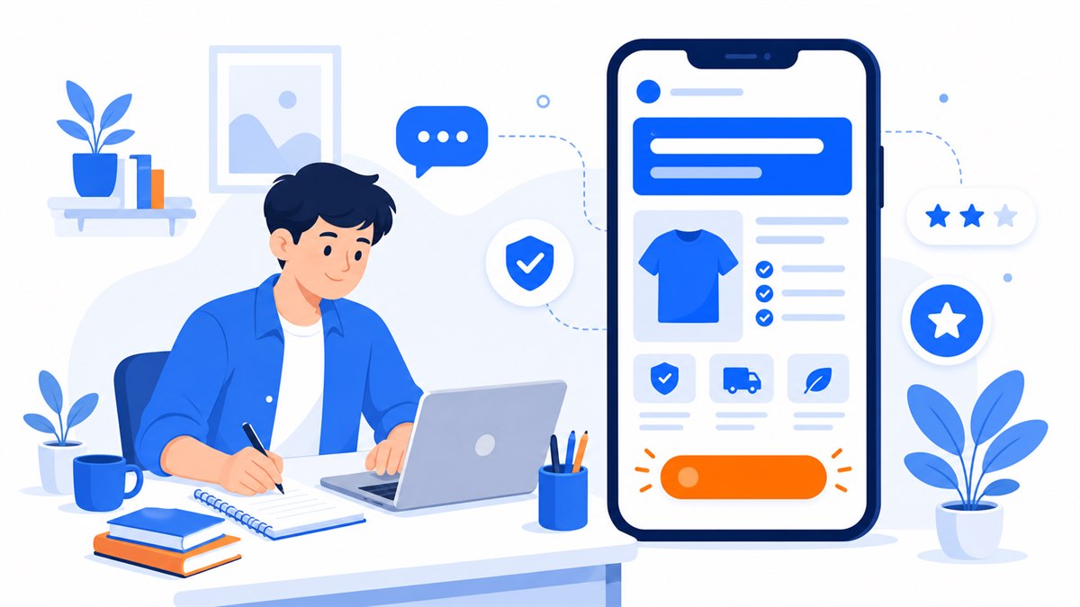
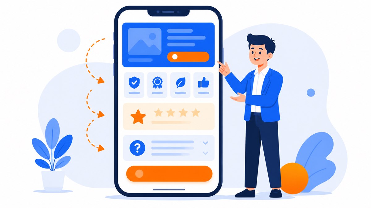
- Write for the customer, not about yourself: start from the worries and questions they message you most.
- The headline must tell visitors what they get within the first few seconds — the more specific, the more believable.
- Turn every feature into a benefit using the formula: feature + "which means" + what the customer gains.
- Use your customers' own language, cut hollow phrases, and back everything up with real photos, real reviews, and real numbers.
- Calls to action need a decisive verb, must appear in several places, and must be easy to tap on a phone.
Most shop and restaurant owners make the same mistake with writing landing page copy: they write about themselves instead of writing for the customer. The page fills up with phrases like "we are proud to offer" and "premium-quality products," yet visitors finish reading and still have no idea how their life gets any better.
Run ads to a page with weak copy and you're pouring money down a drain. Visitors tap the ad, scroll for five seconds, and leave. Get the copy right and the same traffic can deliver two or three times as many phone numbers — just by changing the words.
This guide walks through each section with specific examples from a pho restaurant, a clothing shop, and a spa, so you can write your own sales page without hiring anyone.
Where to start writing landing page copy: understand your customer first
Before you type a single word, you need to answer two questions: what is frustrating my customers right now, and what are they afraid of when they hand over money? Skip those and you end up with generic lines anyone could have written.
The fastest way to find out is to scroll back through old messages. What do customers ask before they buy? "Do you deliver?" "How long does shipping take?" "Is there a warranty?" "Can people with sensitive skin use this?" Every repeated question is a worry you need to address on the page — don't make customers message you just to find out.
A skincare spa isn't selling a "10-session course." It's selling relief from the fear of seeing pitted skin in the mirror before a wedding. A motorcycle repair shop isn't selling "genuine oil changes." It's selling peace of mind that the bike won't die in traffic on the way to work. Hit those real worries and customers feel like you've read their mind.
A formula for writing headlines that pull people in
The headline is the largest text at the top of the page. Visitors decide to stay or leave in the first few seconds, and the headline is what they read. A vague opener like "Welcome to our store" wastes a very expensive opportunity.
A good headline does three things: says what you sell, says who it's for, and names the biggest benefit. The more specific, the more believable.
A few formulas that are easy to apply
- Benefit with a number: "Lose 6 lbs in four weeks — no starving" hits harder than "safe weight loss."
- Hit the pain point: "Hair falling out every time you wash it? The right cut hides thinning spots in 30 minutes."
- A concrete promise: "Locksmith at your door within 20 minutes, including public holidays."
- A situational question: "Need a 10-table banquet set up by this weekend?"
Avoid headlines that just brag: "Market leader," "Trusted number one" — everyone claims those, and visitors don't believe a word of it. Tell customers what they get; don't tell them how great you are.
A headline isn't there to show who you are. It's there to make customers see themselves in it.
Write benefits, not just a list of features
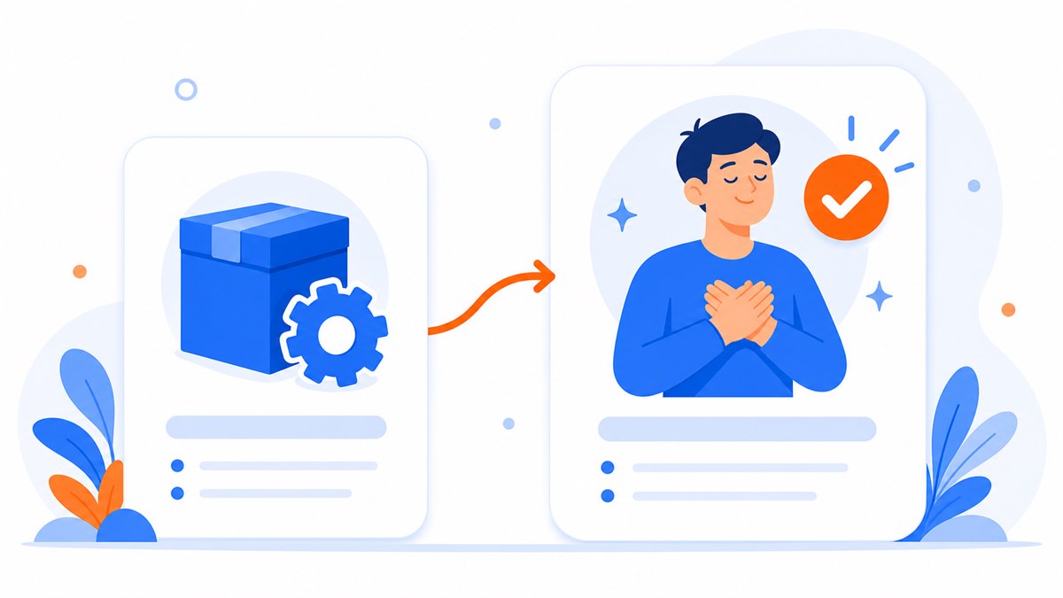
This is the most common mistake in landing page copy. Sellers love features; customers only care what those features actually do for them. A feature is what the product has. A benefit is what the customer gets.
The fix is simple: write the feature, then add "which means" and keep going with what the customer gains.
- 25 cm mattress, independent pocket springs → which means the person next to you can toss and turn all night and you still sleep soundly, waking up without back pain.
- Cool-touch stretch fabric → which means you can wear it to the office all day in summer heat and stay dry and comfortable, no damp patches.
- Bread toasted fresh on the spot → which means the crust is always crisp, crackling when you bite in, never chewy like pre-packaged bread.
Keep the feature details too — some customers like to dig in — but push them down the page. The top section must lead with benefits, because that's what keeps a first-time visitor reading.
The order of sections on the page matters just as much as the writing itself. If you're not sure what should come first or last, check out the structure of a high-converting sales landing page for a solid framework to fill in.
Use your customers' own words — drop the jargon
Customers don't talk to each other in marketing-brochure language. They say "my skin feels less greasy," not "superior sebum control." They say "I can eat a lot without feeling sick," not "a refined culinary experience." Write the way they speak and they feel at ease — like you actually know them.
The easiest way to find the right words: go back through old comments, messages, and reviews and copy exact phrases your customers use. That's your most authentic word bank, more trustworthy than anything you'd invent yourself.
Cut every hollow phrase — "comprehensive solution," "world-class difference," "premium experience." They've been used so many times they mean nothing anymore. Replace them with specifics: "head massage included after every wash — 15 minutes," "delivered within 2 hours inside the city," "exchange or return within 7 days, no questions asked."
Back up claims with real proof and specific numbers
Online shoppers always carry a small doubt: will I get scammed? Does the product actually look like the photo? Is this business real? No matter how good the copy is, without proof customers hesitate. Your job is to remove doubt with things people can actually see.
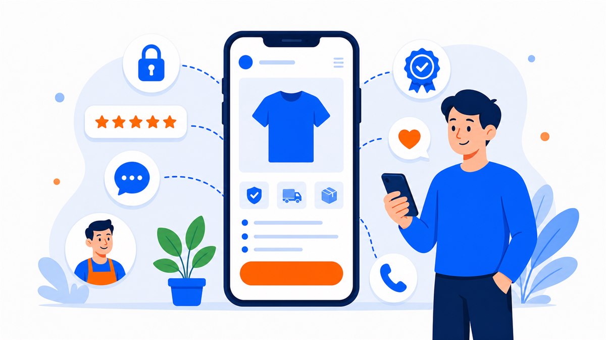
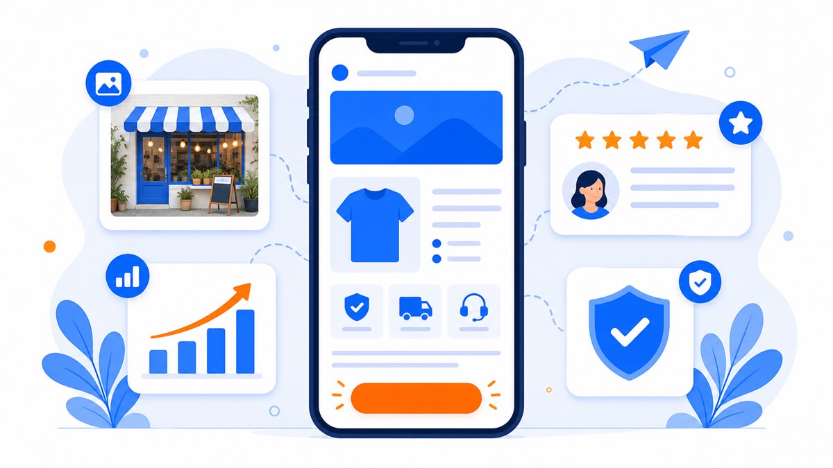
- Real photos, not stock images: shots of the actual shop, actual dishes, actual staff, actual customers using the product. A slightly rough real photo beats a perfect-looking fake.
- Reviews with names and faces: screenshot actual comments and thank-you messages from real customers. One plain-spoken compliment from a real person outweighs ten polished sentences.
- Specific numbers: "over 2,000 cups a month," "on this street for 4 years," "more than 800 returning customers." Odd numbers read as more credible than round ones.
- Clear guarantees: how long is the warranty, how does an exchange work, what happens if they're not satisfied.
Trust is a whole topic in itself — not just a few review lines. For a deeper look at the signals that make customers feel safe enough to buy, read the 8 trust signals that make customers comfortable buying online.
One warning: don't fabricate numbers. Customers notice exaggeration quickly. "Trusted by millions" on a shop that opened last month reads as an obvious lie. A true number, however small, beats a impressive-sounding fake one.
Write a clear call to action
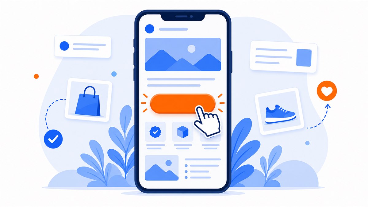
If a visitor reads the whole page and still doesn't know where to tap, all that effort is wasted. The call to action must spell out the next step with a decisive verb: "Message us on Zalo for a quote," "Book a table tonight," "Call to schedule," "Leave your number and we'll call back within 15 minutes."
Avoid generic button labels like "Submit," "Learn more," "View details." These give customers no reason to tap right now. Add a short reassurance nearby to reduce the perceived risk: "Free consultation," "No payment required upfront," "We reply during business hours."
Place buttons in several spots: right at the top for people who are already ready, then again after each key section for people who just got convinced. Most visitors are on a phone, so buttons must be large enough to tap without zooming in.
There are a lot of small tricks to writing and placing buttons so people actually tap them. See the full breakdown in call-to-action buttons: how to write and place them so customers tap.
Every section on the page should push the customer one step closer to the button.
A checklist to review copy before you publish
Before publishing, read through the page with the eyes of a first-time visitor. Go through this list and fix anything that's missing:
- Does the headline clearly tell visitors what they get within the first few seconds?
- Has every feature been turned into a specific benefit?
- Are there any hollow phrases or jargon customers wouldn't understand?
- Are there real photos, real reviews, and real numbers to build trust?
- Is the call-to-action clear, repeated in enough places, and easy to tap on a phone?
- Does the page load and display cleanly on mobile, with readable text?
- Have you addressed every question customers typically worry about before buying?
A cheap way to test: hand the page to someone who knows nothing about your product and ask them to read it, then tell you what you sell and what they'd get out of it. If they struggle, the copy is still confusing — keep editing.
Frequently asked questions
How long should landing page copy be?
There's no fixed number. It should be long enough to clear all the customer's doubts — no more, no less. For an affordable, easy-to-understand product, short and direct works. For something expensive or complex, like a spa course or an online class, you need more length and more proof. The rule is that every paragraph earns its place; don't write long just to fill space.
I'm not a writer. Do I need to hire someone to write my copy?
You know your customers and your product better than anyone, so you can write it yourself. Write the way you'd explain it face to face to a regular customer, then read it back and cut the hollow phrases. If you're still stuck, most web design services can help polish the copy as part of their package.
Is it better to write about features or benefits?
Put benefits at the top of the page — that's what keeps a new visitor reading. Features still matter but belong further down for customers who want to dig into the details. The quick trick: write the feature, then add "which means" and continue with what the customer actually gets.
How do I know if my landing page copy is working?
Look at the ratio of visitors who actually message or leave a phone number. If lots of people arrive but few make contact, the copy isn't convincing enough — usually the headline is weak or there's not enough proof. Try changing one section at a time and compare before and after.
Should I use multiple calls to action on one page?
Yes. Put one button right at the top for people who are already ready, then add more after each key section for people who just got convinced. Just make sure all buttons lead to the same primary action — don't give customers too many different things to choose from.
Need a professional website or landing page?
Web Trong Ngày delivers in 24 hours, all-in for $40 — preview the demo first, pay only when you are happy, own it for life.