How to Structure a High-Converting Sales Landing Page
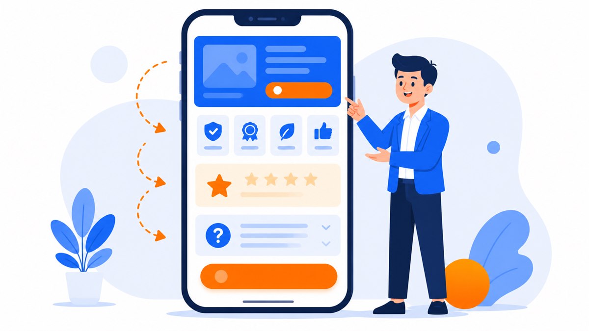
- Structure your landing page to follow the visitor's thought process: need first, then benefits, then proof, then handle doubts, then close.
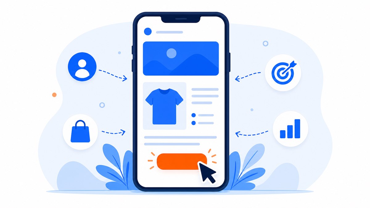
- The hero section must name the pain point within seconds, with a real photo and a visible button in the first frame.
- Genuine proof — reviews, before-and-after shots, customer message screenshots — is more persuasive than any amount of self-promotion.
- Spread call-to-action buttons across several points on the page. Keep forms short. Add call, Zalo, and Messenger buttons for visitors who prefer messaging.
- The most common layout mistakes: opening with a company pitch, burying the buy button, using stock photos, slow load times, and no mobile optimization.
Same product, same ad budget — but two landing pages produce wildly different conversion rates. One loses visitors after a few seconds; the other keeps them reading all the way to the order button. The difference is the order of the sections.
This article covers what sections a sales landing page should include, the sequence that works, and what job each section must do. Every section comes with concrete examples from clothing shops, pho restaurants, spas, and hair salons so you can apply them immediately.
If you're still fuzzy on what a landing page actually is, take five minutes to read What Is a Landing Page? A Plain-English Guide for Beginners first, then come back.
Why landing page structure decides your conversion rate
Visitors don't read a landing page like a book. They scroll top to bottom and constantly ask themselves: is this for me, can I trust this, how do I buy? If the page answers those questions in the right order, they keep going. If it doesn't, they leave.
Most visitors in Vietnam browse on a phone, on the move, with a small screen. They won't scroll through a long company introduction just to find what you're selling. Every scroll that gives them no new reason to buy loses another slice of your audience.
A well-structured landing page works like a skilled salesperson in a face-to-face conversation: lead with the right need, lay out the benefits, bring in the proof, clear up the doubts, then close. Get the order wrong and it's like asking for payment before you've even introduced yourself.
Visitors don't leave because the product is bad. They leave because the page didn't answer the question in their head at the right moment.
The hero section: a headline that hits the pain point
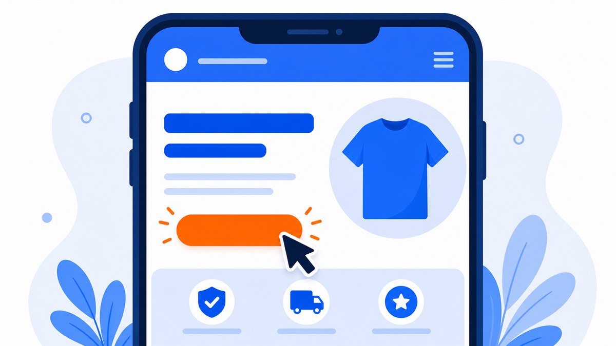
The hero section is the first frame visitors see before they scroll. It must answer within seconds: what is this page selling, who is it for, and why should I care? A generic line like "Welcome to our store" burns the most valuable space on the page.
The headline should name exactly what the visitor wants or what's bothering them. A spa should write "Clear deep-set acne in 3 sessions, no recurrence" rather than "Professional skincare services." A pho place selling delivery should write "House-recipe beef pho delivered in 20 minutes, broth simmered 12 hours" rather than "Traditional cuisine."
Directly below the headline: one supporting line that adds detail, a real photo of the product or the space, and a prominent call-to-action button. Don't make visitors scroll before they see the first order button.
What the hero section needs
- Main headline that names the biggest benefit and speaks to what the visitor cares about
- Supporting line that clarifies the headline in one sentence (who it's for, what makes it different)
- A real photo of the product, dish, or space — skip generic stock images
- One button leading to an order form, sign-up, or Zalo message
The benefits section: why should they choose you
Once visitors know what you sell, they want to know what they get. This section turns features into concrete benefits. Don't just write "100% cotton" — write "absorbs sweat, comfortable all day in summer heat." Customers buy results, not specifications.
The most readable format on a phone is three to five small blocks, each one covering a single benefit with a simple icon and a one-line explanation. A skincare shop might break it into: clean ingredients, safe for sensitive skin, lab-tested, fast delivery within the city.
Each benefit should have a specific detail behind it. "Fast delivery" means "within 2 hours inside the city." "Warranty" means "exchange within 7 days if it doesn't fit." Numbers and specific promises are more credible than adjectives. How to phrase benefits persuasively is covered in depth in Writing Landing Page Copy That Converts.
Features answer "what is it." Benefits answer "what does it do for me." Customers only pay for the second.
The social proof section: real reviews and real photos
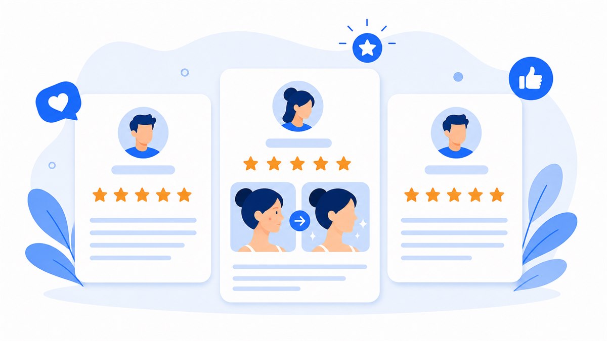
After reading the benefits, visitors start to wonder: sounds great, but is it true? The proof section resolves that. This is where you put past customer reviews, photos of customers using the product, before-and-after shots, number of orders fulfilled, or screenshots of customer feedback messages.
The more genuine the proof, the more powerful it is. A hair salon posting a real before-and-after of a coloring job, with the client's name and a short comment, is more convincing than ten paragraphs of self-praise. A restaurant screenshotting its 5-star reviews from a food delivery app works just as well.
Avoid stock photos or name-free generic testimonials. Savvy shoppers can spot fake reviews instantly. More types of trust signals that give customers confidence are covered in 8 Trust Signals That Make Customers Comfortable Buying Online — pick the few that fit your industry.
Easy-to-collect proof
- Screenshots of customer compliments in chat (blur any private info)
- Before-and-after photos for beauty, repair, or cleaning services
- Number of orders shipped or customers served (only cite a real figure you have)
- Reviews with a real name and photo — ask permission before posting
The objection-handling section: answering the questions in their head
Before tapping the buy button, everyone has a few final questions: what's the warranty, can I return it if I don't like it, how long does shipping take, does the price include everything? If the page doesn't answer, visitors either message to ask (and many won't bother, so they just leave) or find a competitor with clearer answers.
A short FAQ near the bottom of the page handles this cleanly. List the four to six questions customers ask most often and answer them. If quality concerns might be a barrier, state your return policy right here so visitors feel safe enough to tap the button.
This section also reduces the load on you: fewer repetitive messages asking the same thing. A clothing shop that publishes a sizing chart and exchange policy up front gets far fewer "do you have my size?" messages.
The call-to-action section and contact form
This is what the whole page is leading to. After you've convinced visitors, give them a clear path to act: tap to order, leave a phone number, or message on Zalo. The button must stand out, and the text on it must say exactly what happens next: "Order now," "Get a free consultation," "Book a haircut."
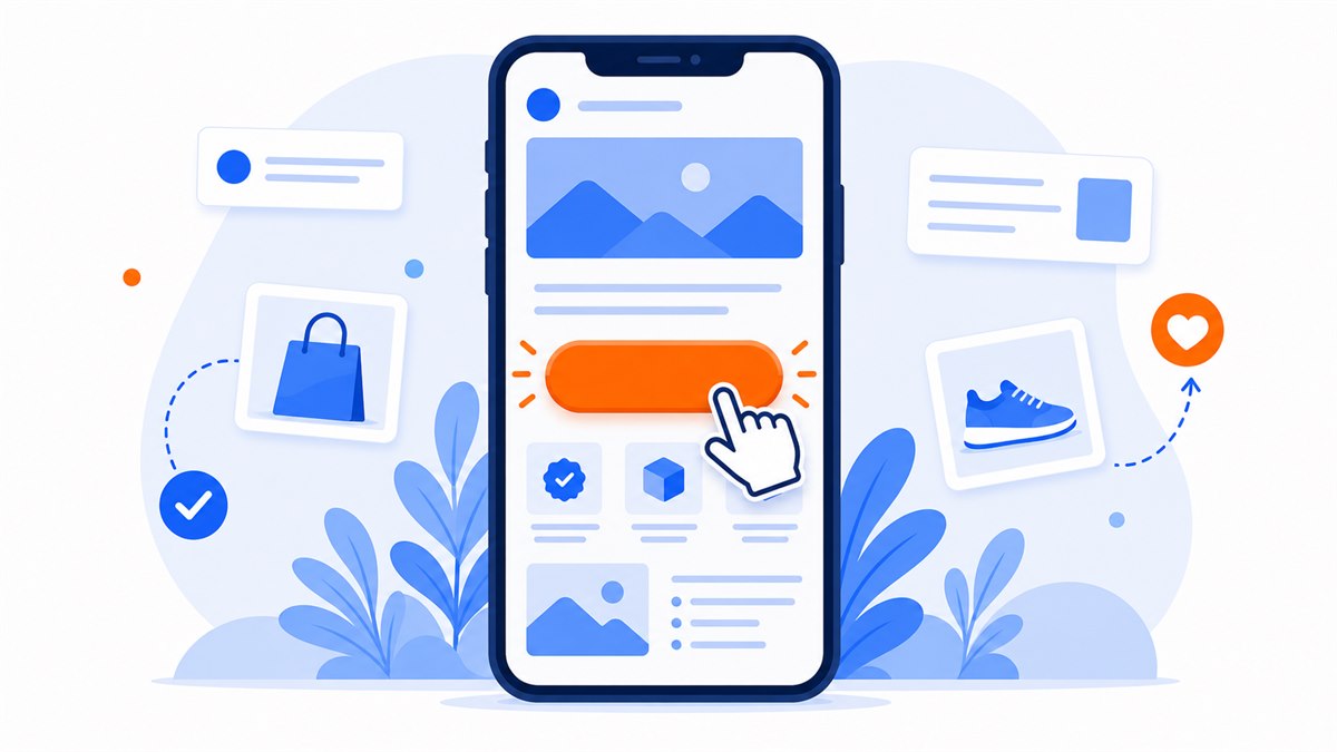
Don't put the only call-to-action button at the very bottom of a long page. On a longer page, place buttons at several points: after the hero, after the proof section, and at the end. Different visitors decide to buy at different moments — the button must be there when they're ready. How to write and position buttons so visitors actually tap them is analyzed in detail in Call-to-Action Buttons: How to Write and Place Them So Customers Tap.
Keep the contact form short. Asking for a name and phone number is enough in most cases. Every extra field you force visitors to fill in is another reason to give up. For Vietnamese shoppers, adding a tap-to-call button, a Zalo button, and a Messenger button often works better than a form alone, because many people prefer messaging to filling in a form.
- Button text names the action clearly — avoid vague labels like "Submit" or "Continue"
- Short form that only asks for what you actually need to follow up
- Call, Zalo, and Messenger buttons pinned in place so visitors can tap at any point
- Repeat the reason to buy right next to the button (fast delivery, warranty, current offer)
Common landing page layout mistakes
Knowing the sections is one thing; putting them in the wrong order still breaks the page. Here are the most common mistakes that make a good-looking page produce no orders.
- Opening by talking about yourself instead of the customer. Visitors don't yet care when you were founded. They care what you can solve for them.
- Cramming too much in at once. Piling features, promotions, and company history into one place leaves visitors overwhelmed. Each section should do one job.
- Hiding the order button. The button blends into the background, or only appears once at the bottom of a very long page.
- Using generic stock photos. Images pulled from the internet make visitors skeptical. Your own real photos are always more trustworthy.
- Slow page loading. Visitors typically leave if they wait more than about 3 seconds. Heavy images and unnecessary animations are the main culprits. Page Load Speed: Why It Matters and How to Improve It shows exactly how to trim the weight.
- Not optimized for mobile. Small text, hard-to-tap buttons, pinch-to-zoom required — you lose most of your visitors instantly because they're on a phone.
Most of these mistakes can be caught by putting yourself in the customer's shoes: open the page on your own phone, scroll top to bottom, and at each section ask "if I were a stranger, would I understand this and want to buy?"
Frequently asked questions
What sections does a sales landing page need?
The core sections are: a hero section with the headline and button, a benefits section, a social proof section (reviews and real photos), an objection-handling section (FAQ), and a call-to-action section with a contact form. Depending on the business, you might add a pricing table or a process walkthrough.
What order should the sections go in?
Follow the visitor's thought process: open by addressing their need, then show benefits, then build trust with proof, then clear up doubts, and only then close. Place call-to-action buttons at multiple points, not just once at the end.
Should a landing page be long or short?
It depends on the product. For low-cost items with quick purchase decisions, a short page is enough. For higher-priced products or services that take consideration, a longer page gives room for full benefits and proof. The rule is that every section must earn its place — no filler.
Do I need a contact form if I already have Zalo and Messenger buttons?
Keep both. Many Vietnamese shoppers prefer Zalo or Messenger over filling in a form, but some still want to leave a number and have someone call them back. Letting customers choose their preferred channel loses fewer leads.
How much does a sales landing page cost, and how long does it take?
On the market, expect around $80 to $200 and a 3-to-5-day wait. When comparing, ask upfront what's included: domain, hosting, SSL, mobile-readiness, the number of revision rounds, and ongoing maintenance costs after the first year. Web Trong Ngày delivers in one day for $40, all-in — full ownership transferred, one payment, no monthly fees.
Need a professional website or landing page?
Web Trong Ngày delivers in 24 hours, all-in for $40 — preview the demo first, pay only when you are happy, own it for life.