Conversion Rate Optimization for Landing Pages
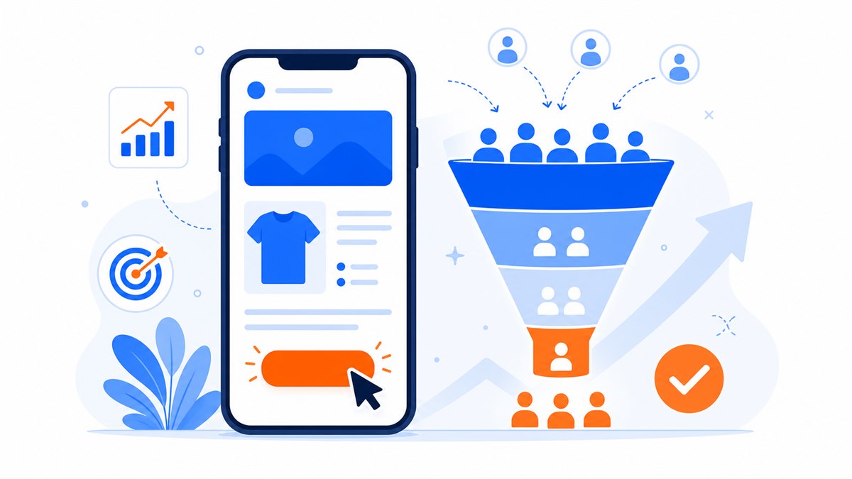
- Conversion rate is the percentage of visitors who do what you want; use your current number as the baseline and nudge it up week by week.
- A page that takes more than about 3 seconds to load on a phone loses visitors before they ever see the call button; compressing images is the easiest fix with the biggest impact.
- The headline should tell visitors what they get, and the form should have only 2–3 fields that are truly necessary.
- Trust signals — real photos, genuine reviews and a clear guarantee — decide whether a visitor feels safe enough to leave their number.
- Measure with Google Analytics and test one change at a time to know precisely what's working.
If your landing page gets hundreds of visits a day but only a handful of people leave their phone number, the problem usually isn't the traffic — it's the conversion rate. With the same number of visitors, a page that's tuned in the right places can generate twice as many leads without spending another dollar on ads.
The good news is that most of the reasons visitors leave are fixable, and often quickly: the page loads too slowly, the headline is vague, the form asks for too much, or the visitor doesn't yet trust you enough to tap. This article walks through each issue one by one, with real examples from restaurants, clothing shops and spas, so you can spot what's happening on your own page.
What is a conversion rate, and what's a good one?
The conversion rate is the percentage of visitors who do what you want them to do. That might be leaving a phone number, tapping a call button, messaging you, or placing an order. If 100 people visit your page and 3 leave their number, your conversion rate is 3%.
There's no universal benchmark. A landing page selling an online course might be happy with 2–3%, while a booking page for a spa's returning clients can hit 8–10%. Rather than comparing yourself to others, use your own current number as the baseline and work to nudge it up week by week.
To understand what a visitor goes through before converting, it helps to know the page structure first. See the structure of a high-converting sales landing page — the optimization tips below only pay off when the foundation is right.
How slow load times and poor mobile display cost you customers
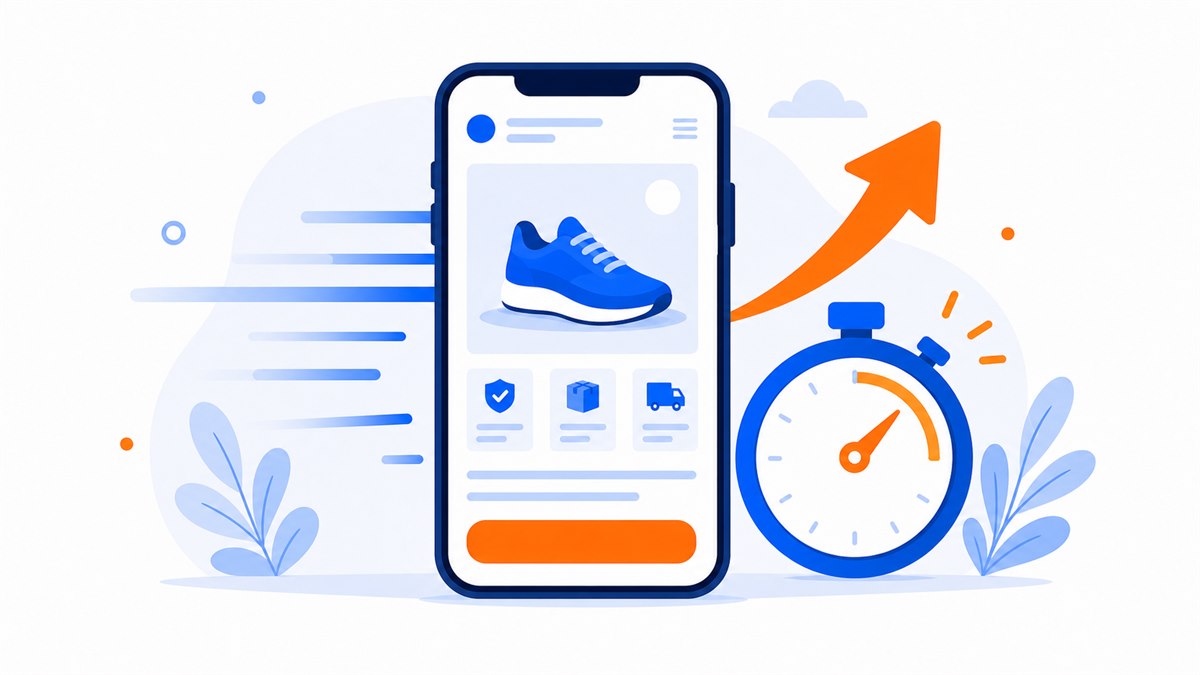
Most visitors in Vietnam browse on a phone, and many are on 3G or a spotty cafe Wi-Fi. If the page takes more than about 3 seconds, they leave — often before the call button even appears. You lose a lead without ever knowing it happened.
The most common culprit is oversized images. A clothing shop uploads a raw 5 MB photo straight from a camera as the hero image; anyone on a weak connection stares at a blank screen. Compressing images down to a few hundred KB makes an immediate difference.
- Compress images before uploading, especially the ones near the top of the page where visitors look first.
- Remove heavy animations and auto-playing video from the top of the page.
- Test your own page on a phone with 3G and count the seconds before the call button appears.
Both topics deserve their own treatment: how to make your page lighter and faster is covered in page load speed: why it matters and how to improve it, and how to make it look clean on small screens is in mobile-ready websites: why most visitors browse on a phone.
Clear headlines and a direct promise lift conversion rates
Visitors decide whether to stay or leave within a few seconds, and that decision is driven by the largest line of text at the top of the page. If the headline just says something like Welcome to our shop, visitors don't understand what you sell, what's in it for them, and they move on.
A good headline tells visitors exactly what they get. Compare two versions for a spa: Professional skincare services is vague; Acne-free skin in 8 sessions — or your money back states the result and adds a guarantee. The second one sells because visitors can immediately picture what they're getting.
Visitors don't read your page — they scan it. Make the biggest line on the page answer one question: what do I get if I stay?
Below the headline, add one short supporting sentence and a clear action button. For writing persuasive copy from top to bottom, see how to write landing page copy that converts.
Reduce form friction so visitors don't drop off
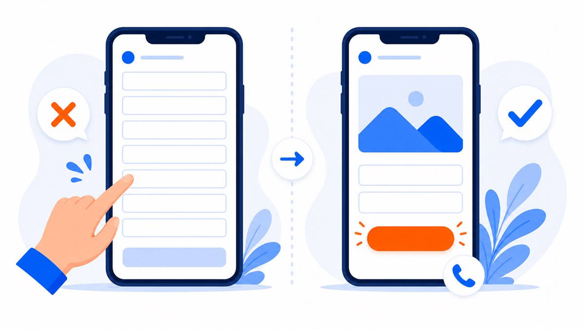
Every field you ask someone to fill in is another reason to quit. A form that demands a full name, phone number, email, address, date of birth and a note will turn away most visitors. On a landing page, a name and phone number are usually all you need to call them back and close.
- Trim the form down to 2–3 fields you genuinely need. Collect anything else later by phone.
- Instead of a form, let visitors tap a call button, message you on Zalo or Messenger — some people simply prefer to chat.
- Label the button with what actually happens, for example Get a quote on Zalo, not just Submit.
- On mobile, pin a call button to the bottom of the screen so visitors can tap it at any point.
Many customers are hesitant to fill out a form but will message Zalo without a second thought. Giving them more channels to choose from usually lifts close rates noticeably. How to integrate these channels cleanly is covered in integrating Zalo, Messenger and a contact form to close faster.
Build trust with real reviews and a clear guarantee
A first-time visitor always arrives with one quiet question: is this place going to rip me off? If the page doesn't answer that question, even a great headline and a short form won't be enough to make them tap. Trust is the element most often overlooked, yet it decides whether a visitor feels safe enough to leave their number.
- Screenshots of real customer messages — with a visible face or real name — are more convincing than anything you say about yourself.
- Photos of the actual shop, workshop or staff show visitors this is a real, serious business.
- A concrete guarantee like 7-day returns or full refund if not satisfied removes the fear of making a bad purchase.
- A visible phone number, address and contact details signal you have nothing to hide.
A hair salon that posts a few before-and-after photos alongside real customer messages will be far more persuasive than a page claiming to be the top salon in the area with nothing to back it up. For the full set of trust signals to put on a page, see 8 trust signals that make customers comfortable buying online.
Simple A/B testing: how to find out which version gets more leads
A/B testing sounds complicated, but the idea is straightforward: make two versions of the page that differ in exactly one place, show each version to a different group of visitors, and see which one gets more leads. The only real discipline required is changing one thing at a time.
- Pick one thing to test — the headline, the button color, or the button copy.
- Create two versions that differ only in that one spot; keep everything else identical.
- Run each version long enough to get at least a few dozen visitors before drawing conclusions.
- Keep the winner and move on to test something else.
If your page still gets low traffic, you don't need automated split-testing tools. Run version A for a week, note the conversion rate, switch to version B the following week and compare. It's rough, but it works for a restaurant or small shop just getting started.
Don't change ten things at once. If the page improves, you won't know what did it — and you won't be able to repeat it.
Measure where visitors drop off so you know what to fix first
You can't fix what you don't measure. Many shop owners run ads for months without knowing how many people visited their page or how many left contact details. Without data, every decision is a guess.
At a minimum, install Google Analytics to see how many visitors arrive, whether they come on a phone or a desktop, and how long they stay before leaving. If you run Facebook ads, add the Pixel so you can see which ad produces actual leads. This is also worth setting up when building a landing page for Facebook and Google ads.
- Count visitors and contact submissions to calculate your conversion rate.
- Check which section visitors exit from — that's usually the first place to fix.
- Compare the rate for mobile visitors versus desktop visitors; a big gap means something is broken on one side.
Once you have numbers, conversion optimization stops being guesswork. Pick one metric each week, fix one thing, and measure again. Your page improves piece by piece — no need to tear it down and start over.
Frequently asked questions
What's a good conversion rate for a landing page?
There's no universal number. An online course page might be fine at a few percent, while a service booking page can run much higher. The right approach is to use your current rate as the baseline and push it up week by week, rather than comparing against anyone else.
Why does my page get lots of visitors but few leads?
Usually one of these: the page loads slowly on a phone, the headline doesn't tell visitors what they get, the form has too many fields, or visitors don't trust the page enough to tap. Fix each issue one at a time and measure the result.
Do I need a special tool for A/B testing?
Not at first. If traffic is low, run version A for a week, record the rate, then switch to version B the next week and compare. When traffic grows enough for automated split testing to be worthwhile, then look at dedicated tools.
How many fields should a form have?
On a landing page, a name and a phone number are usually enough to call back and close. Each extra field is another reason for a visitor to abandon the form. Collect anything else you need later, by phone or Zalo.
What does a landing page need in order to convert well?
Fast load time, clean mobile display, a clear headline, genuine trust signals, an easy-to-tap call or Zalo button, and a short contact form. Before running heavy ads, open the page on your own phone, tap every button and submit the form — make sure visitors don't hit any friction at the last step. Web Trong Ngay builds all of this in for a flat $40, with full ownership and no monthly fees.
Need a professional website or landing page?
Web Trong Ngày delivers in 24 hours, all-in for $40 — preview the demo first, pay only when you are happy, own it for life.