
Integrate Zalo and Messenger Into Your Website to Close Orders Faster

- Integrate Zalo first — it's the most familiar messaging channel for Vietnamese shoppers. A floating button in the bottom-right corner opens a chat window in one tap.
- Add a Messenger button if you run Facebook ads or have an active page, so customers can message you without leaving your site.
- Don't skip a tap-to-call button and a short contact form (name and phone number only) for customers who prefer to call or reach out outside business hours.
- Keep it to two to four contact buttons total, placed in the right spots, and test each one on a real phone — too many buttons confuse customers and block the screen.
- Replying within a few minutes matters more than any design polish: the first shop to give a clear price is usually the one that closes the sale.
Whether a customer reaches out depends on the contact buttons on your site, not on how polished the design looks. Vietnamese shoppers are used to tapping once and starting a chat. Ask them to copy a phone number, open Zalo separately and search for your name, and you've already lost them.
A sales page without a chat button is like a shop with a locked door: people can see inside, like what they see, but have nowhere to ask the price. Add a Zalo button, a Messenger button, a tap-to-call button and a short form, and customers have four ways to start a conversation.
Below: which buttons to add, where to put them, how many is enough, and why replying within a few minutes beats any design trick.
Why contact buttons decide whether a customer messages you
Vietnamese shoppers have a buying habit: see something they like and want to ask right away. Still in your size? How much to ship to Da Nang? Can I pre-order? If there's no place to ask right on the page, most of them leave and forget. It's not that they don't like your product — they just hit a wall at the moment they wanted to ask.
Take a cosmetics seller as an example. Good-looking site, clear product photos, but the only contact info is a phone number buried at the bottom. To ask a question, a visitor has to memorize the number, open their dialer, and call — and many people are reluctant to call a stranger. So they bounce back to Facebook and keep scrolling. The same products, with a floating Zalo button in the corner, open a chat window in one tap, and far more visitors will actually reach out.
- Customers avoid phone calls but are happy to message, because messaging lets them respond on their own time.
- Customers won't bother typing out a phone number or email address — the fewer steps, the more contacts you get.
- Most visitors are on a phone, so buttons need to be large and easy to tap with a thumb.
Integrating Zalo into your website: the most familiar channel for Vietnamese shoppers
Almost everyone with a smartphone in Vietnam has Zalo. That's why integrating Zalo into your website should come before Messenger. Customers don't need to add you as a friend or search your name — they just tap the button and a chat window opens with your Zalo number.
How the Zalo button should work
The simplest setup is a floating button in the bottom-right corner of the screen, always visible no matter how far a visitor has scrolled. On a phone it opens the Zalo app and starts a chat with you; on a desktop it opens Zalo Web. The customer types one sentence and they're done — no saving a number, no extra steps.
A bakery in Binh Thanh district once explained that customers used to place birthday cake orders through Facebook comments, which got mixed in with everything else and were hard to track. After adding a Zalo button to their website, cake orders shifted entirely to Zalo — complete with photos of the design they wanted and a delivery address — all in one place, much easier to confirm.
When to use a Messenger button
If your shop runs Facebook ads or gets a lot of traffic from a Facebook page, a Messenger chat button is a natural bridge. A customer is scrolling Facebook, taps your ad, lands on your site, then messages you using their own Facebook account — and all those messages land in your page inbox for easy management.
Messenger has a nice advantage: the chat bubble opens right on the page, so customers never leave your site. On desktop, the familiar chat bubble pops up and they type immediately. This works especially well for fashion, accessories and snack sellers whose customers mostly come from Facebook.
Many shop owners wonder whether to focus on Facebook or a website. I covered that in detail in website vs. Facebook page: the short answer is use both — let the website be where customers look carefully and commit, and let Messenger be one of the channels they message through.
- If you run Facebook ads or have an active page with a lot of followers, turn on Messenger.
- If you sell mainly to older customers or people who don't use Facebook much, prioritize Zalo and a call button.
- To keep it simple, pick one primary chat channel — don't pile on every option and create confusion.
Tap-to-call and a contact form: two things not to skip
Not every customer wants to chat. Some people — especially older shoppers or anyone in a hurry — just want to call. A tap-to-call button handles that: on a phone, one tap dials your number automatically. No memorizing, no typing.
Imagine a pho restaurant that takes evening reservations. A customer is out, pulls up the restaurant's site, sees a clear call button, taps it and books a table right then. If they have to find the number and dial each digit manually, many of them won't bother.
Contact form: keep it short
A form works for customers who are reluctant to message or call, or who reach out outside business hours. One rule only: fewer fields is always better. Name and phone number are enough for you to call them back. Asking for email, address, date of birth and reason for contact is actively chasing customers away.
- Full name — one field.
- Phone number — the only truly required field.
- Message — optional; whoever wants to write something can.
The submit button also needs clear text so customers know exactly what they're tapping — something like Get advice or Book now. How to write and place these buttons so customers actually tap them is covered in effective calls to action.
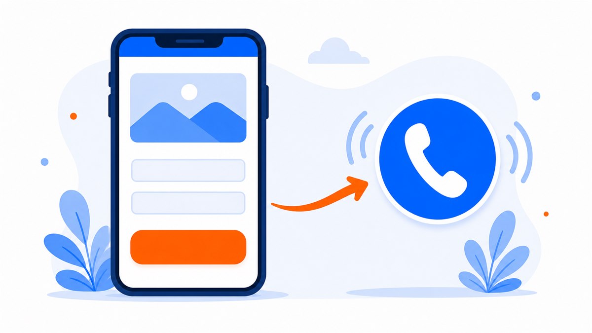
Where to put the buttons and how many is enough
A common mistake is cramming in everything: Zalo, Messenger, Telegram, Viber, a call button, email, a form — each one floating and blocking most of the phone screen. Customers don't know which to tap, and the product content is covered up. Too many choices causes hesitation, and hesitation causes exits.
A clean rule of thumb: pick two to three main channels. For most Vietnamese shops, Zalo, a call button and a short form in the contact section is enough. If you have an active Facebook page, add Messenger for four — and stop there. No more than four floating buttons at once.
Where to place each button
- Floating buttons in the bottom-right corner for Zalo, Messenger and tap-to-call — always visible as a customer scrolls, easy to hit with a thumb.
- A phone number or small call button in the top bar for anyone in a hurry.
- One button at the end of each key section — after pricing or after the product description — right when a customer is deciding.
- A dedicated contact section with a short form, a map and opening hours if you have a physical location.
Fast replies close orders — slow replies lose them
Setting up all the right buttons means nothing if a message sits unread for half a day. Vietnamese shoppers typically message several shops at once; whoever replies first with a clear price is who they buy from. The shop that replies later — even at a lower price — has usually already lost the sale.
You don't need to watch your phone all day. A few simple steps keep customers from waiting too long while still feeling looked after.
- Set an auto-greeting on Zalo and Messenger, something like Thanks for reaching out — we'll reply within a few minutes, so customers know their message landed.
- Prepare ready-made replies for questions that repeat: pricing, shipping fees, delivery time, return policy.
- Turn on notifications on your phone so you don't miss messages when you're busy.
A customer asks about pricing at 9 pm. You reply at 9 am the next morning. That order almost certainly belongs to another shop by then.
One more thing: the page has to load fast enough for customers to actually see the chat buttons. If the page drags for several seconds, customers leave before the Zalo button even appears. Speed and contact buttons work together.
When building a new site, ask for Zalo, Messenger, a Facebook link, a tap-to-call button and a contact form to be set up in easy-to-tap positions for mobile. Once the site is handed over, test every button on a real phone to confirm customers can message or call right away.
Frequently asked questions
Is integrating Zalo into a website complicated? Do I need to know how to code?
No coding required on your end. The developer adds a floating Zalo button that points to your business Zalo number. All you need to do is provide that number. Customers tap the button and a chat window opens with you directly.
Should I use Zalo or Messenger for customer contact?
If your customers are mainly Vietnamese retail shoppers, Zalo is the most familiar channel and should come first. If you run Facebook ads or have an active page with a large following, also add a Messenger button. Ideally have both plus a call button so customers can choose.
How many contact buttons is the right number for a website?
Two to four is the right range. For most Vietnamese shops, Zalo, a call button and a short form is enough; add Messenger if you have an active Facebook page. Too many floating buttons cover the screen and confuse customers into doing nothing.
What fields should a contact form include?
As few as possible. Name and phone number are enough to call a customer back and close the order. Add an optional message field for anyone who wants to write more. Asking for email, address or too much other information causes customers to abandon the form halfway through.
Does slow reply time really affect whether a sale closes?
It has a big impact. Vietnamese shoppers typically message several shops at once, and whoever gives a clear price first is who they buy from. Setting up an auto-greeting and preparing ready answers for common questions means you won't miss customers.
Need a professional website or landing page?
Web Trong Ngày delivers in 24 hours, all-in for $40 — preview the demo first, pay only when you are happy, own it for life.