Urgent Ad Landing Page: What to Prepare in 24 Hours
- An urgent ad landing page works best for one campaign, one product or one specific offer.
- The page should focus on one primary action: call, Zalo message, form submission, booking or consultation request.
- Preparing the offer, real images, pricing or quote method, contact details, FAQ and tracking helps build the page within 24 hours.
- Mobile experience, page speed and a short form directly affect ad spend.
- Before launching ads, test contact buttons, forms, Pixel/Google Tag and the page on a real phone.
Some campaigns cannot wait: a course opening this week, a new collection, a real estate project, a spa promotion or a quick product test. In that situation, building an urgent ad landing page is not about simply having a URL; it is about creating a page clear enough to capture leads before the ad budget starts running.
A fast landing page should be simpler than a full website. The goal is for visitors to understand the product, have enough information to ask, and see one clear action: call, message on Zalo or Messenger, or leave a phone number. The first things to prepare are the offer, real images, form, contact buttons and conversion tracking.
When should you build an urgent ad landing page?
An urgent ad landing page makes sense when a business needs a dedicated page for one campaign, instead of sending traffic to a general homepage or a fanpage with scattered content.
- You are about to run ads for one product, service or offer.
- You need to test demand before investing in a larger website.
- You want to collect leads through a form, Zalo or phone calls.
- You have a short campaign: opening, launch, discount, student recruitment or booking.
- The fanpage has too much mixed content and does not guide visitors to the right information.
A fast landing page needs one goal
A common mistake is trying to put everything on one page: company introduction, all products, photo galleries, hiring, blog, policies and long pricing tables. For urgent ad traffic, the page should focus on one main goal.
Choose one primary action
- Message on Zalo for consultation.
- Call now to book.
- Leave a phone number for pricing.
- Register to reserve a slot, receive an offer or get a demo.
- Book a viewing, consultation, skin check or course consultation.
Secondary buttons can still exist, but the page needs one main CTA throughout. For a deeper guide, read What Is a CTA?.
What should be prepared before building in 24 hours?
To build a landing page in one day, speed is not only about the designer. The project owner should prepare the minimum content so the page does not go through unnecessary revision loops.
- Main product or service. Choose one group to advertise first.
- Offer. The promotion, reason to leave details now and deadline if any.
- Real images. Product, location, team, customers, before-after photos or demo screenshots.
- Pricing or quote method. Show a price range, package or "get a consultation" if pricing is not public.
- Contact details. Phone number, Zalo, Messenger, fanpage and address if available.
- Common customer questions. Fees, timeline, warranty, return policy, booking and service area.
- Tracking details. Google Tag, Meta Pixel or conversion code if already available.
If not everything is ready, you can still start with a minimum version. But real images, the offer and contact details should be ready because they directly affect lead conversion.

The page structure should stay simple
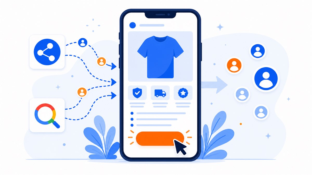
A good ad landing page does not need to be as long as a company profile. Ad visitors are often impatient, so the first screen must answer three questions fast: what this is, who it is for and where to click.
- First screen. Headline matching the ad, main benefit, image or visual and CTA button.
- Problem and solution. Speak to the visitor's need without wandering.
- Product/service/offer. Images, benefits, difference, price or quote method.
- Trust signals. Real photos, feedback, project count, address, warranty or commitments.
- Form or contact buttons. Place them early and repeat them near the end.
- FAQ. Answer the questions that make visitors hesitate before messaging.
For a fuller structure, use High-Converting Landing Page Structure as a reference.
Do not ignore mobile, speed and forms
Most ad clicks come from phones. A rushed landing page that loads slowly, uses tiny text, hides buttons or asks for too much form information can waste ad budget quickly.
- Call, Zalo and Messenger buttons should be large and easy to find.
- Forms should only ask for what is needed: name, phone number and request.
- Images should be compressed so the page opens fast on mobile data.
- No horizontal overflow, no text overlapping images on small screens.
- CTA buttons should appear at the top, middle and end of the page.
Before launching ads, open the page on a real phone, turn off Wi-Fi, tap every button and submit the form. The guides on page speed and mobile-friendly websites help check two common weak spots.
Tracking should be ready before ad spend starts
Running ads to a landing page without conversion tracking makes it hard to know where the money goes. At minimum, there should be a way to record form submissions, button clicks or calls.
- Meta Pixel for Facebook or Instagram Ads.
- Google Tag or conversion code for Google Ads.
- Successful form-submit event.
- Click events for Zalo, Messenger and call buttons.
- A lead destination: email, Google Sheet, CRM or at least one fixed form inbox.
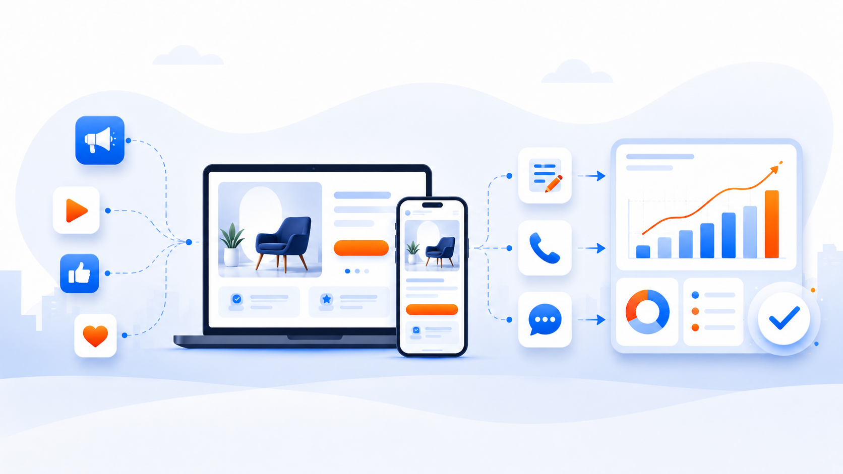
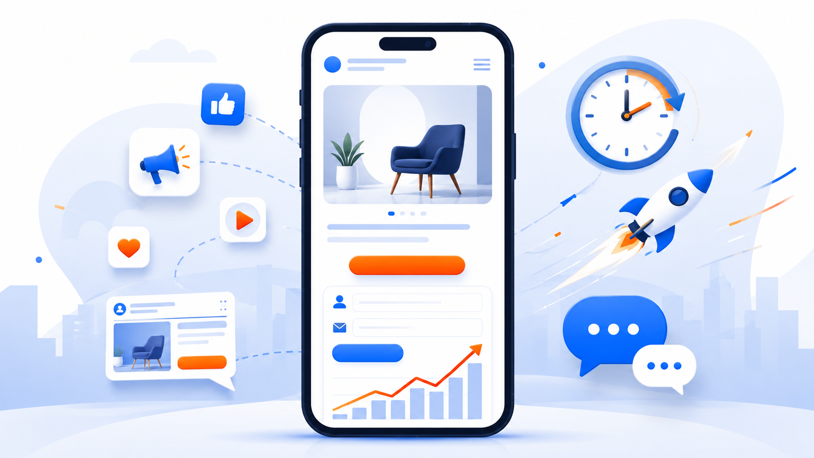
A 24-hour roadmap for a usable page
A compact schedule can look like this:
- Hours 1-2: confirm the goal, offer, main action and target audience.
- Hours 3-5: collect images, product information, policies and FAQs.
- Hours 6-12: build the layout, write copy, add form and contact buttons.
- Hours 13-18: polish mobile, compress images, check speed and test the form.
- Hours 19-24: add tracking, review content, test on mobile and prepare the campaign link.
With Web Trong Ngày, the $40 package fits urgent landing page projects: demo in 1 day, first-year domain and hosting included, Zalo, Messenger, Facebook, quick call, contact form, mobile-friendly layout, preview before payment and lifetime ownership.
Frequently asked questions
Can a 24-hour ad landing page be good enough?
Yes, if the scope is focused: one product or one offer, prepared images and information, a short form, clear contact buttons and fast mobile loading. A 24-hour page should not be expected to replace a complex multi-page website.
How many sections does an ad landing page need?
At minimum, it should include a first screen that matches the ad, benefits, product or offer, trust signals, a form or contact buttons and FAQ. The key is helping visitors understand quickly and know where to click.
Should ads go to a fanpage instead of a landing page?
A fanpage is useful for conversation, but a landing page is better when you need to present one product, one offer and measure conversion. A common setup is sending ads to the landing page, then using Zalo or Messenger buttons to close the lead.
Does a fast landing page need Pixel or Google Tag?
Yes, if the campaign is serious. Pixel or Google Tag helps measure form submissions, button clicks, messages and calls so you can optimize the ad and page.
Can cheap landing page design create extra fees?
It can if the quote does not define domain, hosting, SSL, forms, chat buttons, revision rounds, tracking and maintenance fees. Ask what is included and whether any monthly fee is required.
Need a professional website or landing page?
Web Trong Ngày delivers in 24 hours, all-in for $40 — preview the demo first, pay only when you are happy, own it for life.